In the busy streets of Japan, from the narrow aisles of Don Quijote* to the intimate corners of local CD shops, a distinctive form of communication captures the attention of shoppers: the handwritten POP (Point of Purchase) signage. This marketing tool, while seemingly simple, plays a crucial role in Japan’s retail environment, showcasing a blend of creativity, personal touch, and strategic marketing that differs notably from practices seen abroad.
*Don Quijote is the biggest variety stores in Japan.
What is handwritten POP?
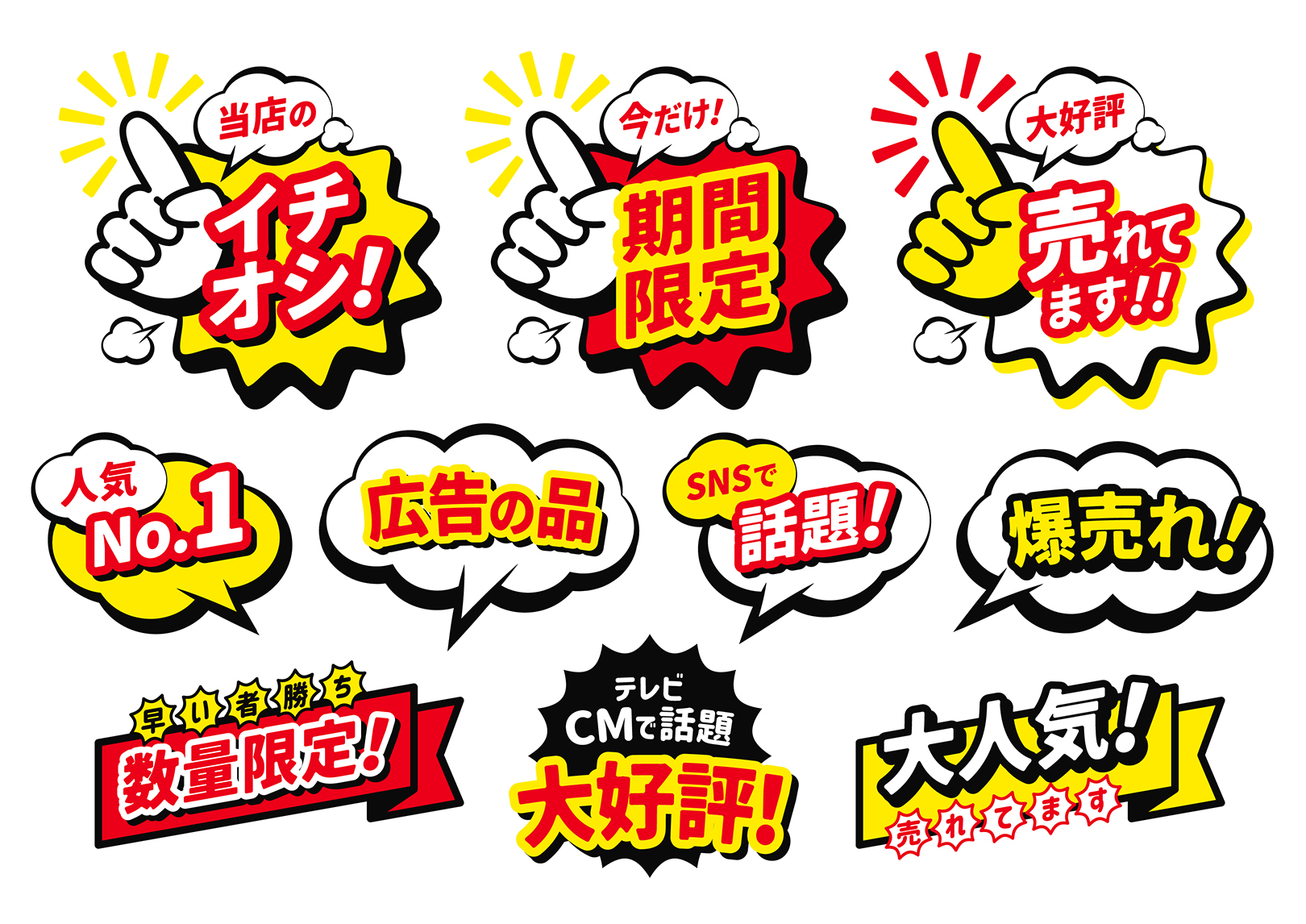
Handwritten POPs are vibrant, often colorful signs placed near products to draw attention, convey information, and promote sales. They range from simple price tags to elaborate illustrations that highlight product features, discounts, or recommendations. What sets them apart is their personal and handmade nature, offering a stark contrast to the digital displays and professionally printed materials commonly used in Western retail environments.
The history of handwritten POPs in Japan traces back to the country’s post-war era, a time when resources were scarce, and retailers had to find cost-effective ways to attract customers. Shop owners began using their creativity to handcraft signs, a practice that not only saved costs but also added a personal touch to their merchandise presentation.
Why is it unique in Japan?
Comparing Japanese POPs with those found overseas highlights several key differences. In many Western countries, retail signage tends to lean towards a more uniform and professional look, often prioritizing clarity and brand consistency. Japanese POPs, on the other hand, embrace flamboyance and individuality, with a focus on hand-drawn characters and illustrations, whimsical fonts, and a variety of colors. This difference not only reflects contrasting aesthetic preferences but also differing approaches to consumer engagement.
The preference for flashy and elaborate handwritten POPs in Japan can be attributed to several factors.
- The dense retail landscape in Japan means that competition is high, and stores must employ every available means to stand out and attract customers. Handwritten POPs, with their unique charm and warmth, can make a store feel more approachable and friendly, fostering a sense of closeness between the shop and the consumer.
- The handwritten element of these POPs plays into Japan’s appreciation for craftsmanship and artisanal quality. In a culture that celebrates both traditional arts and the pursuit of perfection in everyday tasks, the skill and creativity displayed in POPs resonate well with Japanese consumers, who see value in the human touch and the story behind the product.
- Japanese POPs reflect the Japanese value of storytelling and customer reviews. Japanese POPs often tell a story of a person who should buy the product, have a recommendation from the store staff, and have customer reviews about how popular the product is in the store. The Japanese culture of valuing others’ opinions and testimony triggers the audience.
The handwritten POPs are one of the most popular marketing tools for the retail industry in Japan. For international companies and marketers looking to enter the Japanese market, understanding the significance of these POPs can provide valuable insights into Japanese consumer behavior and the nuanced strategies required to capture their attention. Embracing the local penchant for creativity, personal touch, and meticulous detail can be a key differentiator in a market that values not just the quality of the product, but the story and care behind its presentation.